Research
Researching the gifting brand landscape
I looked at how gifting and lifestyle brands positioned themselves, their tone, packaging and price points, to find a gap for something more premium and personal.
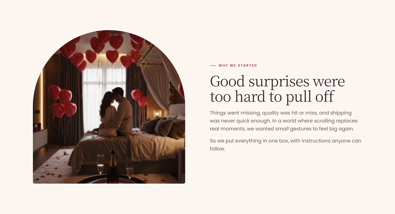
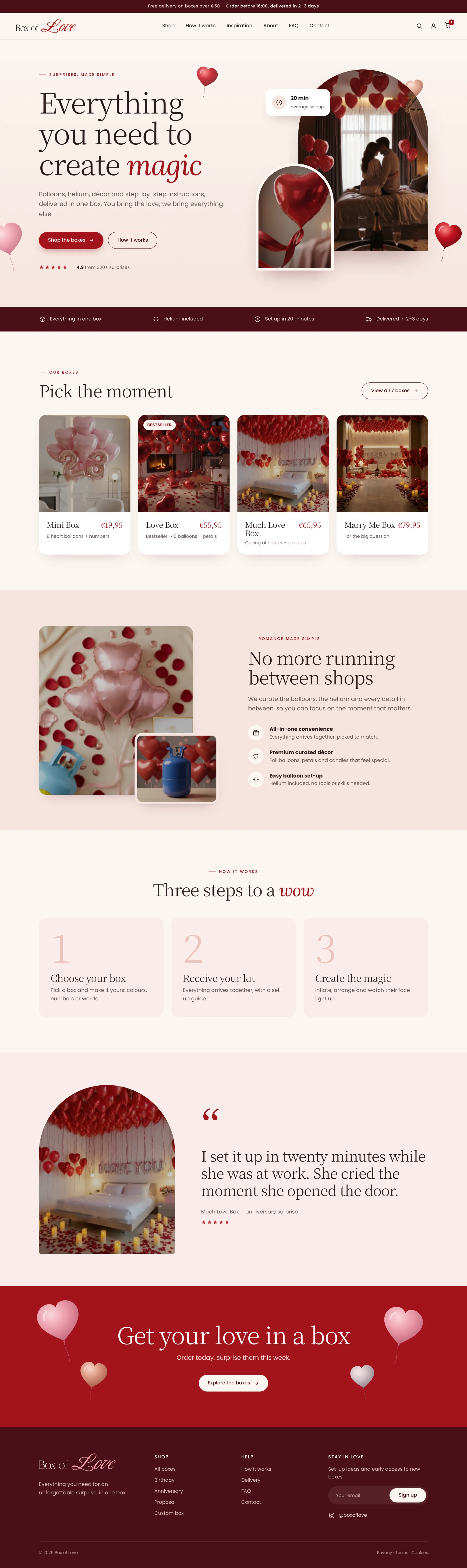
A curated gifting business I designed end to end: brand, product line, packaging and the storefront. A year later I came back to the storefront and redesigned all eight pages to feel like the gift itself.
Research
I looked at how gifting and lifestyle brands positioned themselves, their tone, packaging and price points, to find a gap for something more premium and personal.
Define
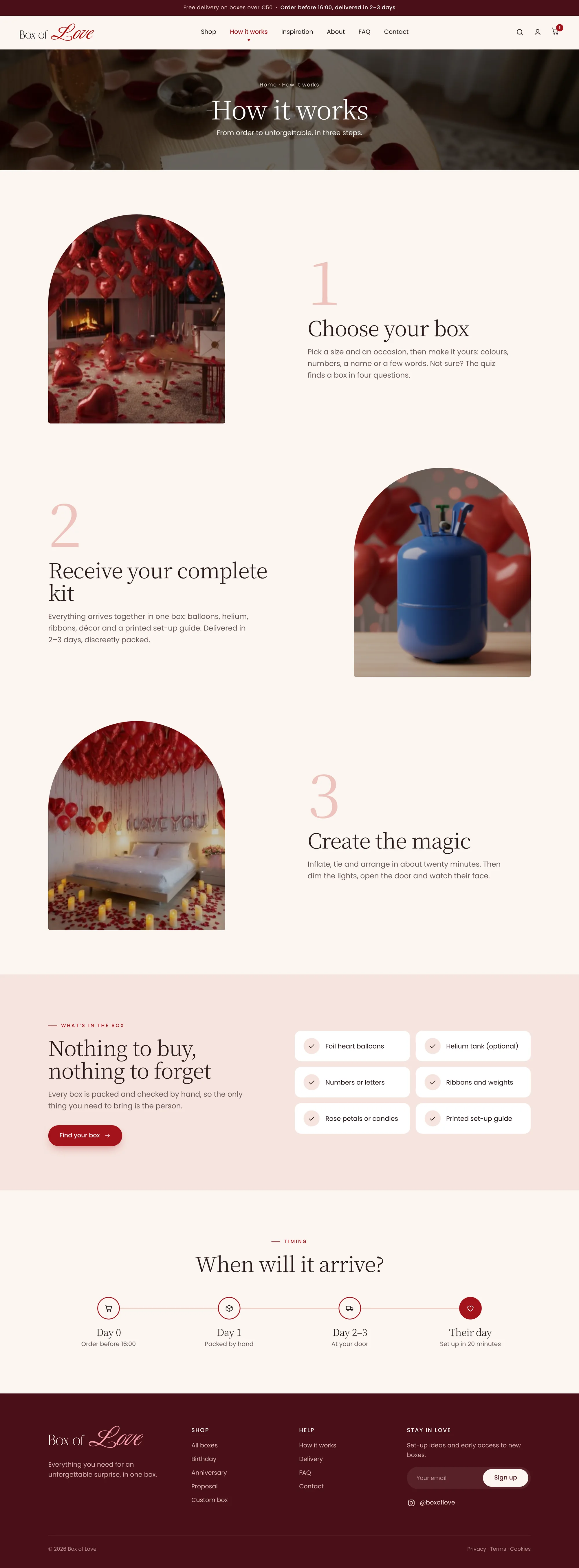
Good gift boxes were hard to find. Things were missing, quality was hit or miss, and shipping was never fast enough for a timely surprise. So the box had to hold everything, with instructions anyone can follow.
Redesign
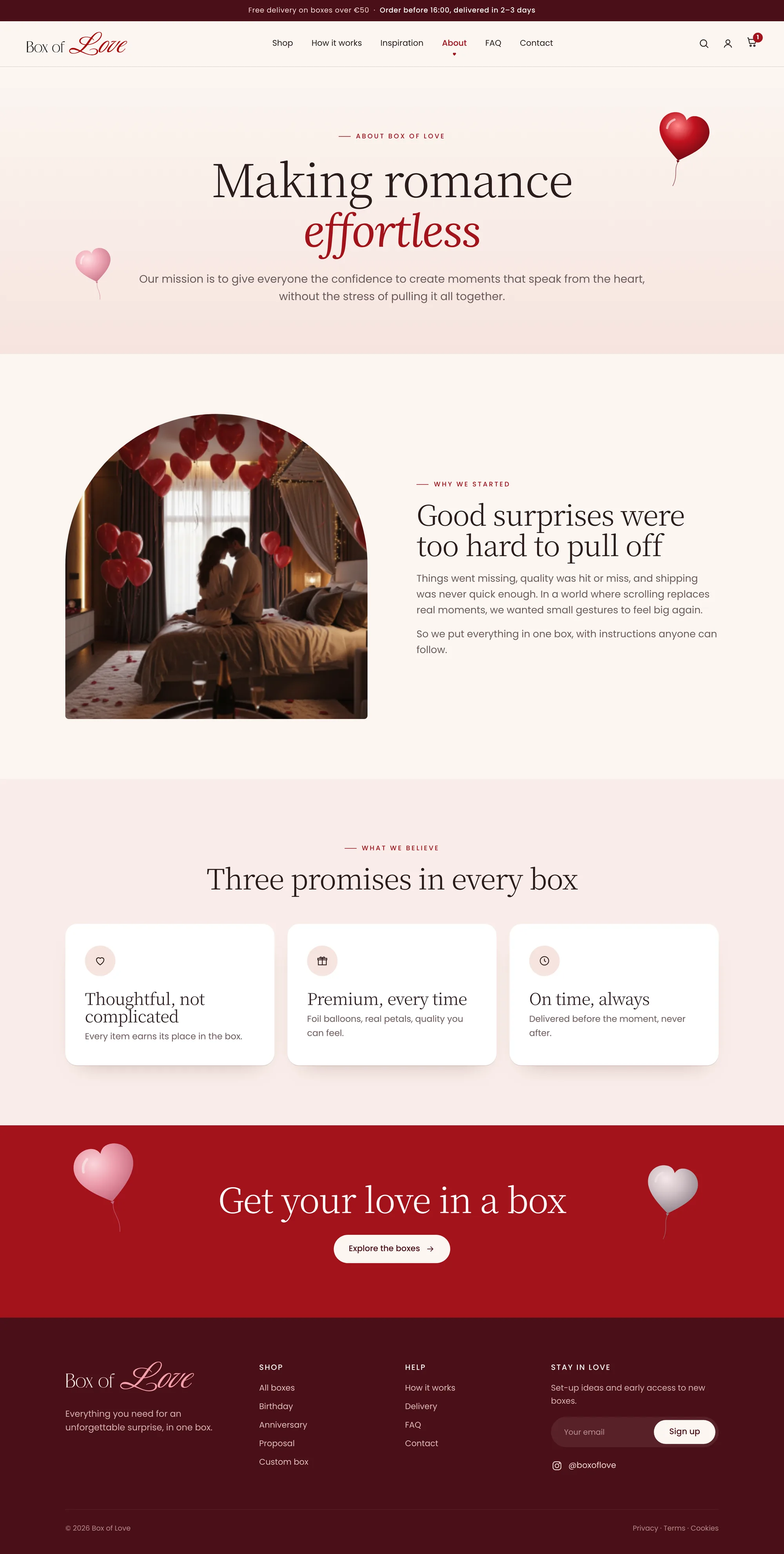
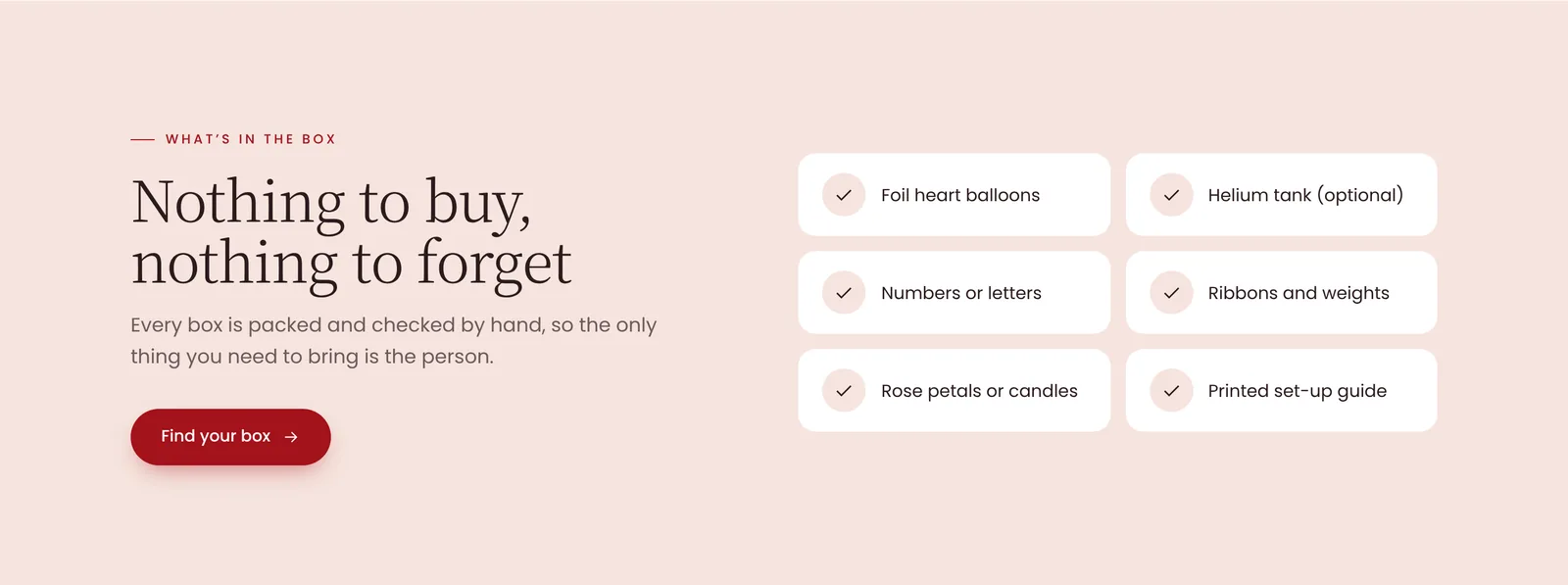
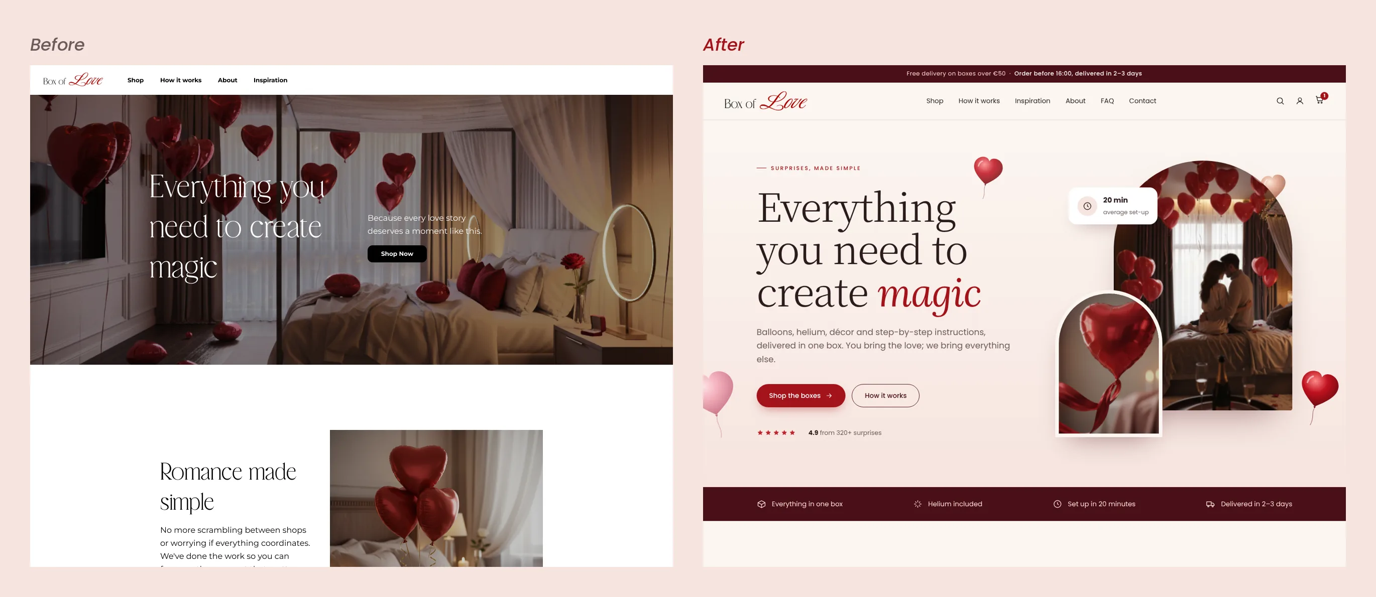
The first storefront was stark white and black, with thin type and grey placeholders. The redesign takes its palette from the logo itself: blush, cream and a deep red. Headings got bigger, every box card now shows a price and what’s inside, and a trust strip answers the first questions before anyone has to ask.
Shop
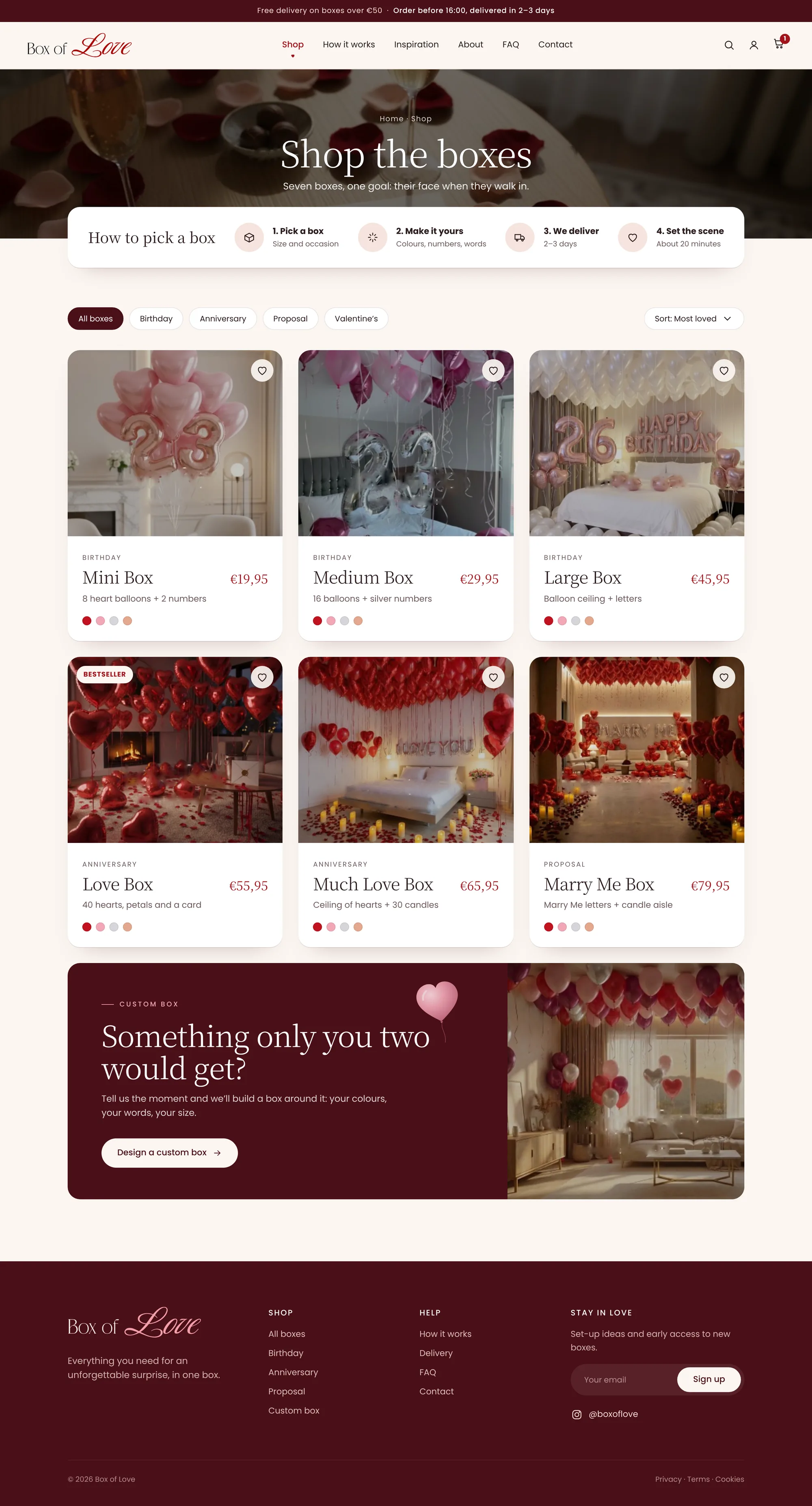
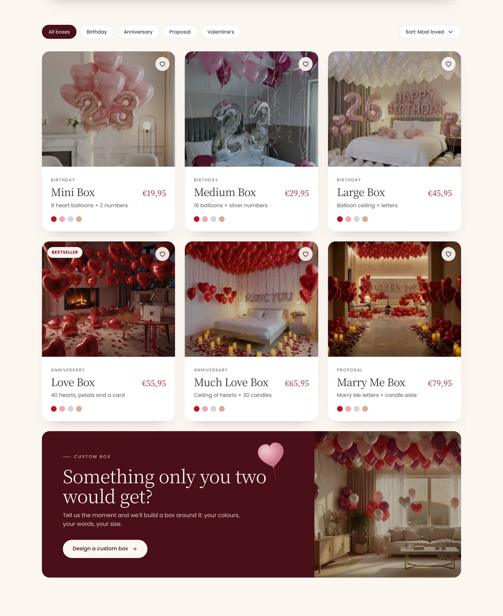
Filters by occasion, a four-step guide to picking a box, and colour dots on every card, so people compare boxes without opening each one.
Customise
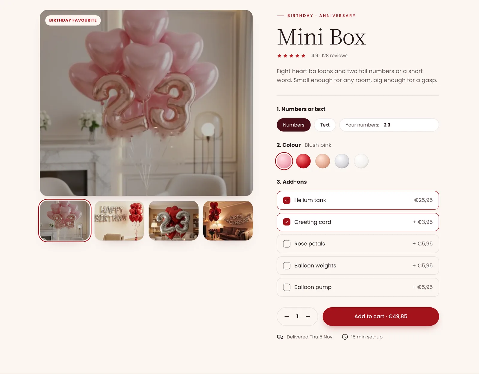
On the product page the photo follows your choices: pick a colour, type the words and watch the preview and the price update before you add it to your cart.
Outcome
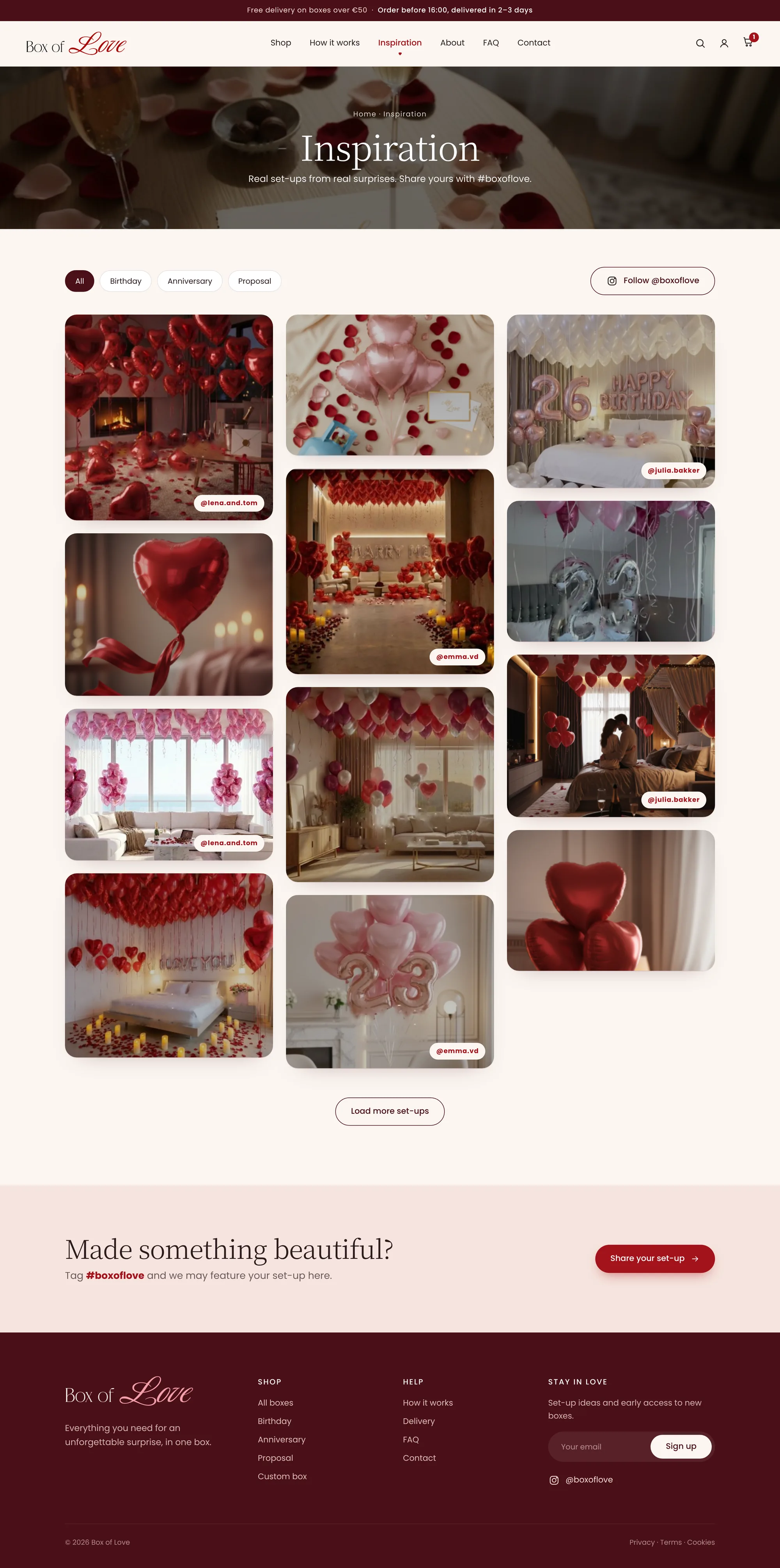
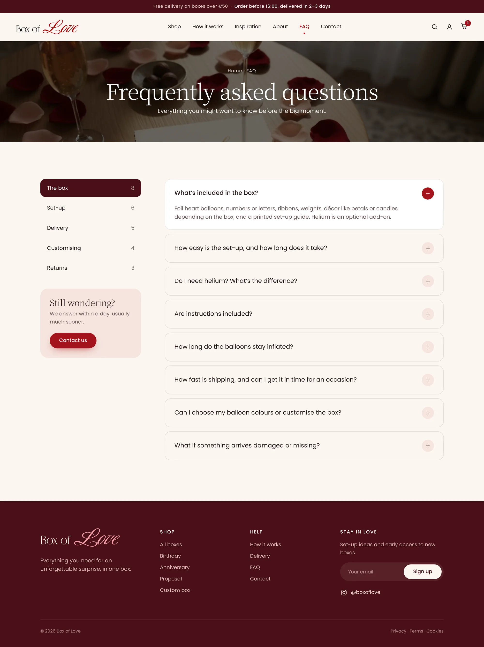
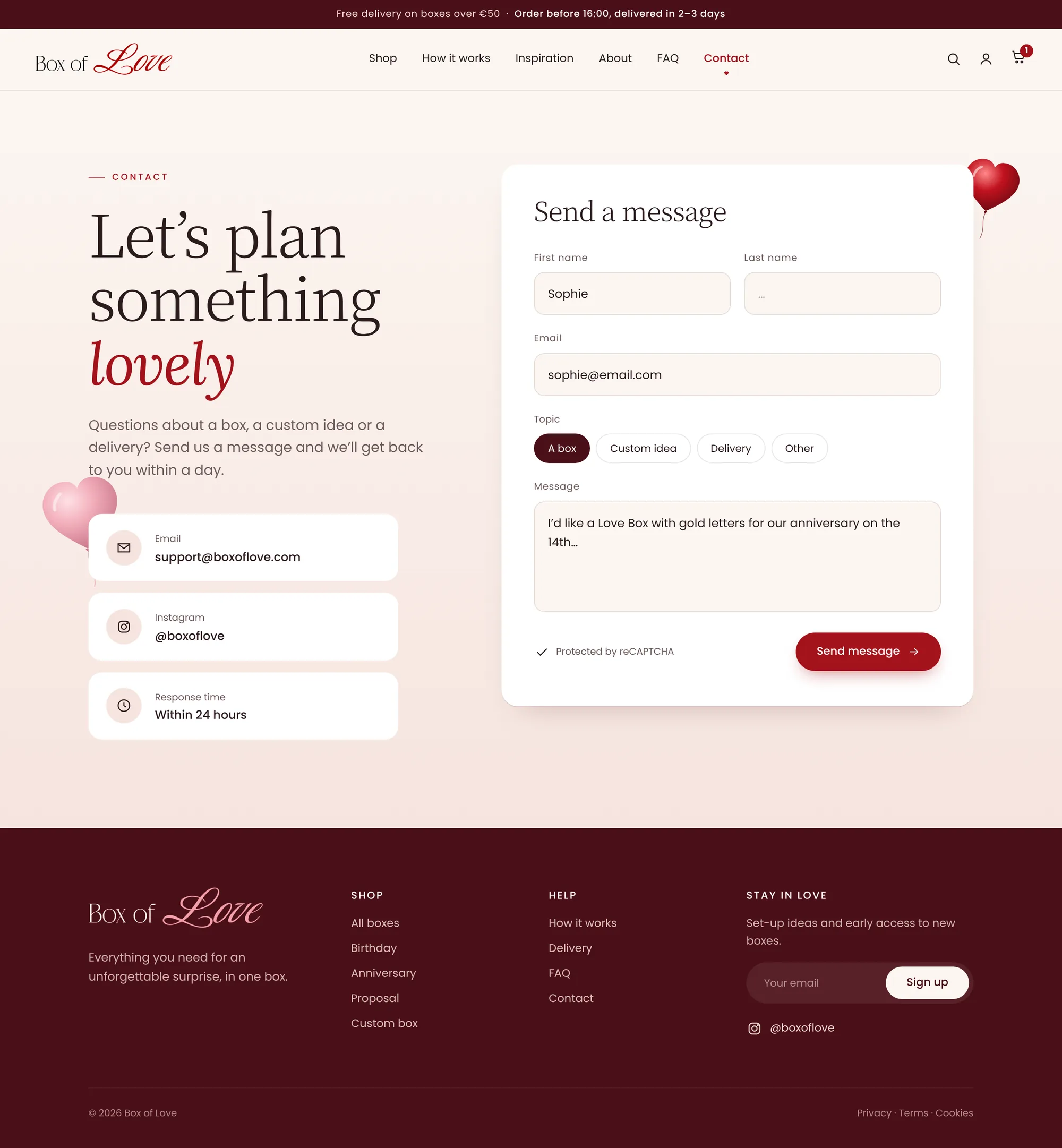
Home, shop, product, how it works, about, inspiration, FAQ and contact now share one warm system. Open any page to see it in full.
ToolsFigma, Webflow, Claude (redesign)